I had an interesting conversation with a fellow Randall enthusiast at Blade about the personal name etching that Bo did early on.
He had noticed on his early fighter and others that he looked at, the individual letters under magnification have grooves that follow the contour of the letter. I looked at his example with a loop, and that's what it was.
However, my early fighter had a smooth texture in each letter under magnification.
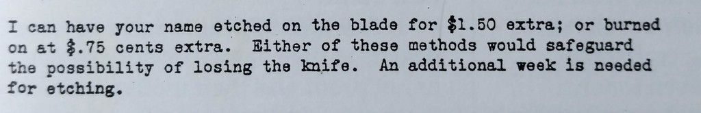
I was looking thru Gaddis' book and found a letter on page 77, dating from 1943, offering both etching and "burning". Could this be the difference?
Sorry, I don't have the ability to magnify the letters for pics, maybe I can take a crack at it later...
There was a third observation on an early knife. The individual letters had 2 individual outlines of each letter, close together, like this =.
I know this is a bit in the weeds, but hey...it's about Randalls😀
So if you have an interest, take out your knives and check it out. Are there other texture observations?
Regards, Sam

 06-08-2017, 09:01 AM


 Similar Threads


 Linear Mode

